
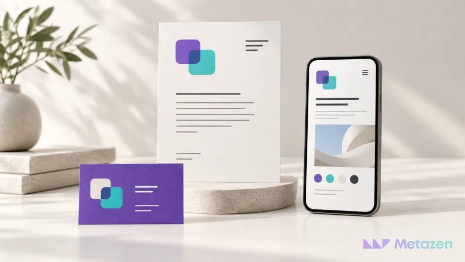
Your proposal looks restrained and formal, your social posts are bright and playful, and your website seems to belong to a different business. Each piece may look good on its own without making sense as part of the same brand. Building a brand identity means deciding what should remain recognizable wherever a customer encounters you.
What Is Brand Identity, and Where Does Visual Identity Fit?
Brand identity is how a brand defines and expresses itself. Its message, tone and recognizable elements should work together. Visual identity is the visible part: the logo, color, typography, photography or illustration style, and layout. Adobe’s explanation of brand identity design treats the visual elements as connected choices rather than isolated pieces of artwork.
The broader term corporate identity can extend to an organization’s communication and behavior, as Istanbul Technical University’s corporate identity explanation describes. The five steps below focus on making a visual system usable in day-to-day business. They do not replace work on company culture or a full brand strategy.
Not every graphic design project creates an identity. A poster or catalog can apply rules that already exist. Our overview of how businesses use graphic design explains the wider range of work. An identity project establishes shared decisions that future designs can use, rather than stopping at a single finished poster.
1. Define the Audience and Message Before Choosing a Look
Start with the people you serve, the value you offer and the way you want to speak. “Modern and high quality” leaves too much open to interpretation. Modern for whom, and useful for which need? Adobe’s brand strategy explanation connects audience, message and visual identity within the same planning framework.
Consider an illustrative workshop that makes custom lighting. If it serves architects, it may need to make dimensions easy to read, show materials closely and present the scope of a quotation clearly. A business selling decorative lights directly to homeowners may need a different emphasis. The workshop is a hypothetical example, not a client case study or a measured business result.
Make the initial direction concrete by answering three questions:
- Whose work are we helping? Name the decision-maker and the information they need.
- Which promise can we actually keep? Choose a real quality for the design to support, without promising speed or performance the business cannot deliver.
- How do we sound? Put a sample sentence beside words such as technical, warm or formal so the tone can be understood.
The output should be a short direction a designer can interpret. For the workshop, that could be “explain made-to-measure production through clear technical information and simple images that show the materials.” No logo or color has been selected yet. The purpose of those choices is now clear.
2. Map the Places Where Customers Encounter the Brand
Gather the materials the business actually uses: its website, proposals, product labels, packaging, signs or social posts. Begin with the places customers see. A large stationery package is not automatically useful if the business rarely sends printed letters.
Compare existing examples on one screen or table. Do the logo versions change? Does one document use rounded lettering while another uses a narrow typeface? Do the product photographs look as though they belong to the same business? Separate differences required by the task from differences that appeared by accident. Not every variation needs to disappear.
The lighting workshop might prioritize proposals, product pages and care cards. Each carries the same identity while helping the customer do something different:
| Application | Keep Consistent | Adapt to the Task |
|---|---|---|
| Proposal document | Logo, core colors, heading and body text styles | The reading order for dimensions, materials, price and delivery terms |
| Product page | Image style, color roles and type hierarchy | Mobile layout, product inspection and the enquiry flow |
| Product care card | Brand mark, type family and illustration style | Readable care instructions within a small printed area |
Record who uses each item and when. The list tells you which applications to test in the first design round. It gives the project a purpose beyond delivering a certain number of files.
3. Connect the Visual Elements Through Shared Rules
If the logo, colors and typeface are chosen separately and left without guidance, each person applying them has to invent the relationship again. Review the choices together: which element leads, which carries information, and which should remain in the background?
Define the conditions for using the logo. Light and dark backgrounds, small spaces and single-color printing may need different treatments. As a real example, IBM’s logo guidance defines surrounding space and variations in use. Study the reasoning rather than copying IBM’s measurements onto your own mark. Check where your logo becomes difficult to recognize.
Give colors roles, not just codes: a core brand color, backgrounds, text and limited accents. IBM’s color system is an example of specified colors working within an application system. Consider their print and screen use. Sharing a color code alone does not guarantee an identical appearance on every material.
For typography, establish a visible difference between headings, explanations and small notes. IBM’s type guidance addresses scale, alignment and hierarchy alongside the typeface. Test real product names and any languages the business uses. An attractive English sample may hide missing characters or awkward line breaks in another language.
Explain image choices through their purpose. Does the workshop need close material details, views of the light installed in a room, or both? If both are useful, describe which information each image should provide. The aim is to make the choices understandable without making every photograph look identical.
4. Test the System with Real Content at Real Sizes
A balanced presentation board can hide problems that appear with a long product name or a small printed card. Before approval, build the applications selected in step two with actual content. Compare short and long headings, versions with and without photographs, a phone screen and, where practical, a print proof.
Consistency does not mean repeating the same layout everywhere. A proposal may need clear comparisons, while a phone screen needs room to inspect a product. The logo and visual language can remain recognizable while the arrangement changes. IBM’s layout approach illustrates how the system can respond to the content and its use.
For the workshop, ask three practical questions. Can a reader distinguish the product name from its dimensions in the proposal? Can someone reach the enquiry area on a phone? Can the person receiving the product read its care instructions? If the answer is no, investigate size, contrast and information order instead of simply enlarging the logo.
A brand color is not automatically a readable text color. Check the contrast of the combinations used for digital text and interface elements. The logo exception in W3C’s text contrast explanation does not extend to the other text on the page.
On a website, applying the identity must work alongside the visitor’s task. Our explanation of what web design includes covers the role of navigation, forms and mobile layouts. Visual identity does not replace usability.
5. Share the Rules and Usable Assets
The team needs to know which file to use, where to find it and what it is for. Brand guidelines explain approved decisions; logo assets and editable templates allow people to apply them. A polished PDF alone may not help the person who has to prepare a proposal the next morning.
Adobe’s guidance on shared creative assets treats logos, colors, type and templates as reusable resources. A particular application is not the requirement. What matters for the handoff is whether the people doing the work can access and use the material.
If the workshop’s sales team will edit the proposal template, ask the person responsible to prepare a sample proposal. A broken layout after changing a heading, a missing font or uncertainty about the correct logo indicates that the handoff is not ready for routine use. Record the problems and update the files and short instructions together.
Assign someone to maintain the current assets and decide who approves changes. Keeping an identity usable does not mean freezing a folder forever. It means making deliberate decisions about what should stay consistent when a new need appears.
Let’s Shape Your Identity Around the Work It Needs to Do
If you already have a logo, replacing it does not have to be the first decision. We can start by examining where your proposals, website and other materials lose consistency. At Metazen, our design and digital project team establishes the business needs and applications, then develops the direction through practical design examples. Explore our graphic design service to see how we can help, from identity decisions to preparing the files your team will use.

