
If visitors have to search the home page, the company profile and several blog posts to understand a service, the problem may start before visual design. Nobody has decided where the answer belongs. A business website content plan assigns information to useful pages; its structure gives visitors a way to move between them.
What Do a Content Plan and Website Structure Decide?
A content plan defines what information an audience needs and why. Website structure decides how that information is grouped and connected. The broader discipline is called information architecture. It extends beyond the menu: Nielsen Norman Group’s distinction between information architecture and navigation separates content relationships from the interface used to move through them.
A website can have sensible service groups but confusing menu labels. It can have an easy-to-use menu while splitting one service description across three unrelated pages. Organizing the material and designing the interface need to work together. Our introduction to what web design covers explains the wider relationship.
Five decisions provide a practical starting framework: the visitor’s task, the condition of existing material, the page groups, each page’s job and how to test the plan. We will use a hypothetical industrial water-treatment business offering installation and maintenance. The example illustrates planning decisions; it does not describe a client project or measured results.
1. Identify the Job Visitors Need to Complete
“We need a professional-looking website” describes a business preference. It does not explain why someone would visit. A person considering a new installation needs different information from someone seeking maintenance for existing equipment. One may want to understand the service and see comparable work; the other may need to check eligibility and submit a request.
Collect questions from sales conversations, support requests and internal site searches where available. Mark customer evidence separately from the team’s assumptions. If there is little evidence yet, begin with conversations instead of assuming everyone understands your terminology. GOV.UK’s guidance on identifying user needs offers a useful example of connecting content to a specific task and supporting evidence.
For the example business, replace “describe our maintenance service” with a more useful need: “As a facility manager, I want to understand the maintenance scope and prepare the information needed to request support.” That raises concrete questions. Which equipment is covered? What is excluded? What information must the request contain?
The output is a prioritized set of visitor questions, before it becomes a page list. You know what the website must answer before deciding what to put in its menu.
2. Review Existing Content and Give Each Answer a Home
Useful material may be scattered across the current website, proposals, project photographs and frequently asked questions. Create an inventory with the content title, existing URL if any, its current accuracy and the person who can verify it. A new website can start with the same list: empty fields reveal missing material.
GOV.UK’s content maintenance guidance connects an inventory with ownership and review. Record when a service description was checked and who will update it. Moving old copy into a new design does not make the information current.
Decide which items to keep, update, combine or leave out of the proposed scope. The installation page can hold the detailed service description while the home page provides a short introduction and a route to it. A preparation article does not need to repeat the full commercial description.
Every question does not need its own page. Information needed for a maintenance request may fit into a short section of the service page. Separate pages become worth considering when services have distinct scopes, examples or enquiry routes. A package’s fixed page allowance should not make that decision for you.
Watch for the same answer appearing under several names. Choose the main location for the detailed explanation. Elsewhere, give readers enough context to decide whether to follow the link.
3. Group Pages Around the Visitor’s Expectations
Your business may have sales, operations and technical departments. Visitors should not need to understand that organization before finding a service. GOV.UK’s principles for planning new content provide an example of organizing information around a user’s task rather than an institution’s internal structure.
An initial page map for the example business could look like this:
| Visitor’s Question | Main Answer Page | Required Content |
|---|---|---|
| What do you provide for a new installation? | Installation service | Scope, working process and enquiry route |
| Can you support my existing system? | Maintenance service | Eligible equipment, limitations and request information |
| Have you completed comparable work? | Relevant project record | Approved photographs, work delivered and verifiable scope |
| Who would I be working with? | Company and team information | Real team members, working approach and areas of expertise |
| How should I prepare a maintenance request? | Preparation article | Information to gather and a route to the maintenance service |
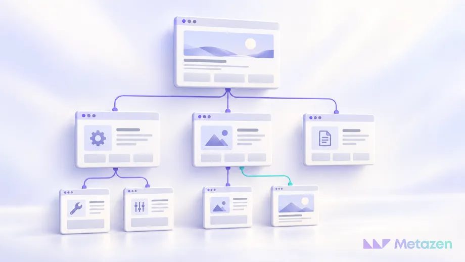
In the hierarchy, Services could contain Installation and Maintenance. Projects could contain individual project records. Company information, contact details and the blog form other content groups. The home page introduces suitable starting points instead of reproducing all their copy.
A visual sitemap uses boxes and connections to make the proposed hierarchy easier to discuss. Nielsen Norman Group’s explanation of sitemaps treats the diagram as a way to communicate a structure, rather than the whole information architecture. A tidy arrangement of boxes is not evidence that visitors understand it.
A planning diagram is different from an XML sitemap. The visual diagram helps a team discuss page groups. An XML file supplies search engines with URL information. Google’s sitemap guidance states that submitting one does not guarantee crawling or indexing.
4. Define Each Page’s Content and Next Action
A page name does not tell the team which materials to prepare. Write a short record for every proposed page: intended audience, question answered, required information or images, useful next action and the person responsible for verifying the content.
The maintenance page might address facility managers and explain whether their equipment can receive support. It needs the service scope, request process and contact information. The next action is a maintenance enquiry, and the service lead verifies the technical scope. The preparation article explains what to gather before that enquiry. Sharing a subject does not mean the pages have the same job.
A service page explains the offer, a project record shows completed work and a blog post teaches something useful about a specific question. A maintenance section in a project record may naturally lead to the maintenance service. Readers do not need a sales link in every paragraph.
Link text should describe the destination. “Information needed for a maintenance request” is more informative than “click here.” Google’s link guidance supports descriptive anchors and useful relationships between pages. Internal links can help search engines discover pages, too. When considering how SEO works, treat the content structure and technical access as related concerns.
Plan headings within each page around its information order, such as scope, required details and the request process. W3C’s guidance on headings explains how heading levels communicate section relationships. An attractive screen mock-up cannot supply answers the content team has not prepared.
5. Test the Plan With Realistic Tasks
Give people who resemble the intended audience small tasks to attempt using the proposed page names. “Where would you find Maintenance?” gives away a label. “You need support for an existing system; what would you look for first, and where?” leaves more room for the person to choose a route. Record hesitation, unexpected choices and missing answers.
The distinction between structure and navigation tests explains why a label-only check and a test of the working interface can reveal different problems. A person who chooses the right page name may still miss that option in the mobile design. Test the grouping first, then try the clickable prototype.
If the groups themselves are uncertain, card sorting can help you explore them. Ask participants to group content labels and explain their choices. The exercise does not validate the entire journey; the resulting structure still needs to be tried against actual tasks.
For the example business, check three outcomes: can someone find the service scope, move from relevant project evidence to the service and understand what an enquiry requires? When a person takes an unexpected route, distinguish a confusing label from an unsuitable group or a missing answer. Revise the plan and try the task again.
Before launch, assign an owner to each page as well as agreeing its content. When a service changes, knowing which pages need review helps keep the original plan useful.
Let’s Plan the Pages Your Customers Need
You may already have service descriptions and project photographs without a clear way to organize them. We can start with those materials. At Metazen, our web and digital project team connects visitor tasks with the content and page plan, then reviews the flow through clickable desktop and mobile prototypes. Explore our web design service to see where we can help with planning, design and development.

